In today’s data-driven business environment, dashboards play a critical role in helping organizations monitor KPIs, analyze trends, and make informed decisions. However, simply creating a dashboard is not enough. Poorly designed dashboards can confuse users, slow down decision-making, and reduce the effectiveness of analytics initiatives.
This is why dashboard design has become one of the most important aspects of modern business intelligence. Looker Studio is widely used for creating interactive dashboards and real-time reports, especially for marketing analytics, SEO reporting, operational tracking, and executive reporting. While the platform offers excellent flexibility and visualization capabilities, dashboard performance and usability depend heavily on how reports are designed.
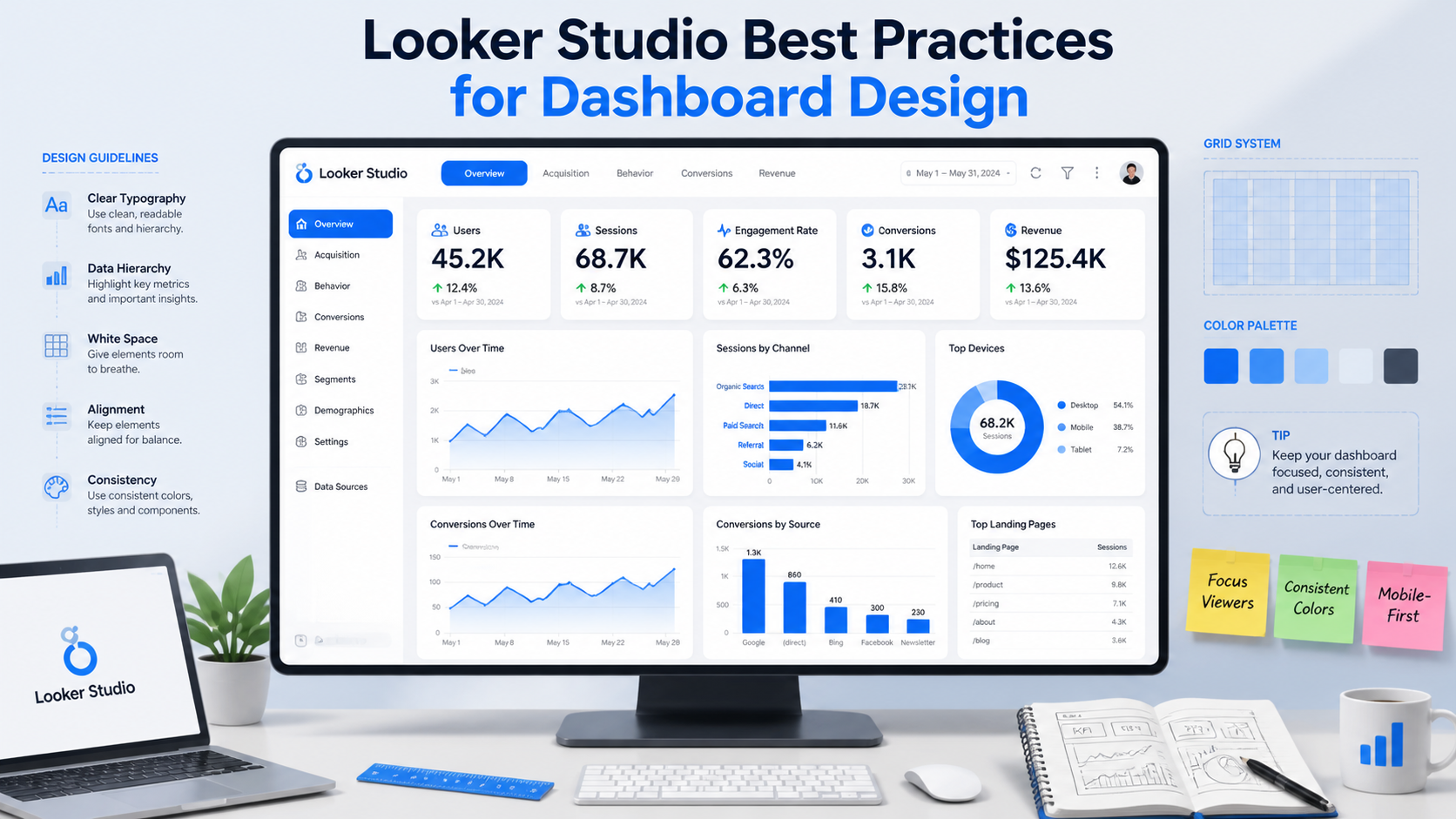
At KnexBI, businesses increasingly focus on dashboard optimization strategies to improve reporting clarity, usability, and performance. In this guide, we’ll explore the best practices for Looker Studio dashboard design in 2026, including layout optimization, KPI structuring, visualization strategies, user experience improvements, and performance recommendations.
Why Dashboard Design Matters
A dashboard should do more than display data. It should simplify complex information, highlight key insights, improve decision-making, support business goals, and enable faster analysis.
Conversely, a poorly designed dashboard often leads to information overload, slow reporting performance, misleading visualizations, low user adoption, and confusing user experiences. An optimized dashboard helps teams quickly identify trends, monitor performance, and take action confidently.
1. Start with Clear Business Objectives
Before designing any dashboard, define its purpose clearly by identifying what problem it solves, who will use it, which KPIs matter most, and what actions users should take from the insights. Different dashboards serve different purposes:
- Executive Dashboard: Focuses on revenue, growth trends, strategic KPIs, and high-level summaries.
- Marketing Dashboard: Focuses on traffic, conversions, campaign performance, and ROI metrics.
- Operational Dashboard: Focuses on efficiency, inventory, workflow monitoring, and real-time alerts.
Clear objectives prevent unnecessary complexity and keep dashboards targeted.
2. Keep Dashboard Layout Simple and Clean
One of the most common dashboard design mistakes is overcrowding reports with excessive charts and metrics. A clean layout improves readability, navigation, user experience, and baseline rendering performance.
- Use Visual Hierarchy: Place the most critical macro KPIs at the top of the canvas.
- Group Related Metrics: Organize sections logically using shapes or containment borders.
- Avoid Clutter: Only include visualizations that actively drive core business decisions.
- Maintain White Space: Proper spacing improves visual scannability significantly.
3. Prioritize Important KPIs
Not every metric deserves equal attention. Businesses should isolate primary KPIs from supporting metrics and secondary insights to structure the dashboard sections cleanly.
| Dashboard Zone | Metric Focus | Example Components |
|---|---|---|
| Top Section | Primary Macro KPIs | Revenue, ROI, Conversion Rate, Sales Growth Scorecards |
| Middle Section | Trend Analysis & Deeper Breakdowns | Line Charts (MoM trends), Bar Charts (Channel comparison) |
| Lower Section | Granular / Supporting Data | Detailed Analytics Tables, Pagination List Views |
4. Use the Right Visualizations
Choosing the wrong chart type can make data difficult to interpret. Select options based on analytical intent:
- Line Charts: Best for trends over time, growth analysis, and forecasting.
- Bar Charts: Ideal for categorical comparisons, ranking analysis, and performance evaluation.
- Scorecards: Used strictly for single-value high-level KPIs and executive reporting summaries.
- Pie Charts: Use carefully; avoid maps with too many categories to ensure clarity.
- Tables: Use sparingly, as large text tables overwhelm users and slow query rendering.
5. Maintain Consistent Design Elements
Consistency is critical for professional dashboard experiences. Ensure fonts, colors, chart styles, filters, and layout spacing remain completely uniform across multi-page configurations.
Color Palette Best Practice: Limit your report to two or three core brand colors maximum. Use neutral tones for structural blocks and bright accent colors strictly to highlight important metrics or anomalies.
6. Optimize Dashboard Performance
Dashboard speed directly affects user engagement and adoption. Slow dashboards frustrate users and reduce reporting efficiency. Keep your lookups performant with these core optimization strategies:
- Limit Charts Per Page: Too many concurrent data visualizations drastically increase response loading times. Splitting metrics over multi-page setups is preferred.
- Reduce Data Complexity: Avoid relying heavily on heavy ad-hoc runtime calculated fields inside Looker Studio. Instead, pre-aggregate calculations at the data tier.
- Use Extracted Data Connectors: Leverage extracted datasets to pull static, cached snapshots for much faster rendering speeds.
- Minimize Blended Data: Complex multi-source blending impacts dashboard responsiveness. Consolidate your joints in BigQuery before importing.
7. Design for Mobile Responsiveness & UI/UX
Many executives and remote teams access data on mobile layouts. Always design with a clean user experience (UX) framework in mind:
- Use single-column vertical linear layouts for easy mobile scrolling.
- Use clear, intuitive labels and avoid internal data-engineering jargon.
- Incorporate interactive filters strategically (e.g., global date range, region selectors) but avoid complex nested dropdowns that can lag.
- Enable drill-down features to allow deeper data discovery without cluttering the initial viewport.
8. Build Scalable Structures & Strategic Storytelling
Modern dashboards should guide users through a clear narrative flow: from a high-level performance overview down to trend analysis, problem identification, and recommended strategic actions. As organizations scale, standardizing KPI definitions, centralizing upstream data sources, and building reusable theme templates ensures sustainable data maintenance.
Additionally, integrate multiple data sources (GA4, Google Ads, BigQuery, CRM platforms) thoughtfully. Only connect platforms required for your immediate business objectives to protect baseline system data quality and reporting clarity.
Common Dashboard Design Mistakes to Avoid
| Critical Pitfall | Negative Business Impact | Strategic Fix |
|---|---|---|
| Overloading Visuals | Information fatigue and paralysis by analysis. | Limit reporting focus to actionable KPIs. |
| Color Overuse | Reduced scannability; masks real anomalies. | Stick to a 3-color palette maximum. |
| Ignoring Speed Tweaks | Low user adoption and operational frustration. | Cache data and use Extracted Connectors. |
How KnexBI Helps Businesses Build Better Looker Studio Dashboards
A well-designed Looker Studio setup is far more than a collection of separate charts; it is an integrated strategic business tool. At KnexBI, we help organizations transform raw numbers into streamlined visual insights across marketing analytics, SEO reporting, e-commerce tracking, and operational dashboards.
By continuously monitoring backend usage patterns and keeping pace with modern design updates (such as predictive AI-generated visualizations), our tailored reporting systems maximize business intelligence efficiency.
Ready to build an optimized, blazing-fast reporting infrastructure for your company? Connect with our data visualization team at KnexBI today.