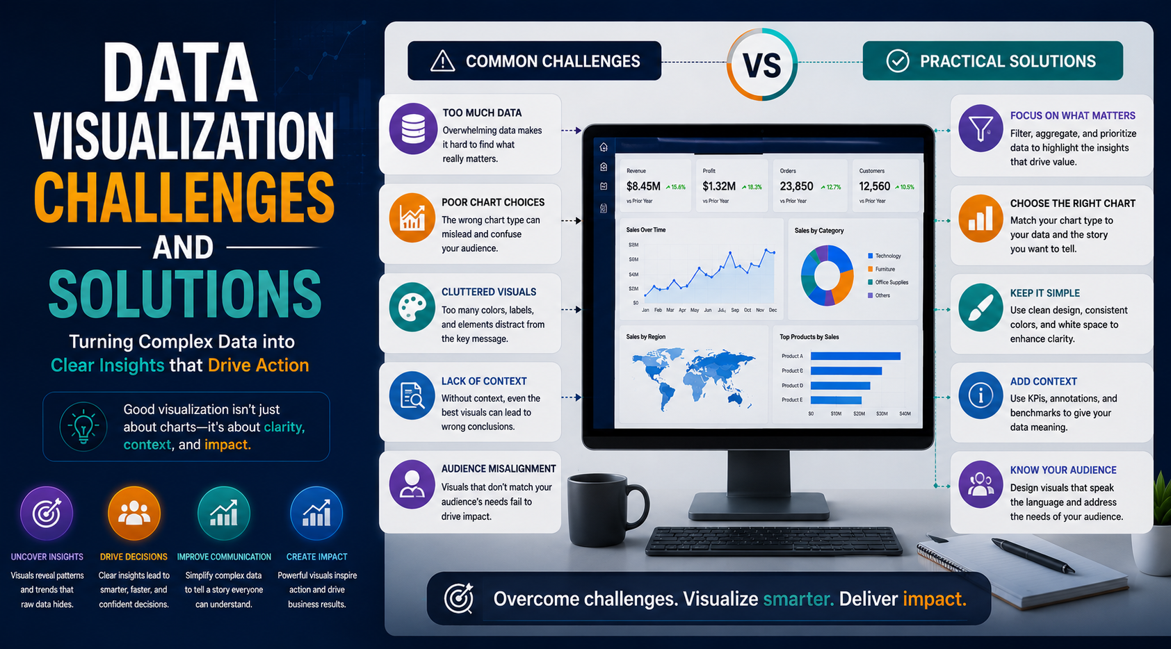
Data visualization has become one of the most important components of modern business intelligence and analytics. Organizations across industries rely on dashboards, charts, and visual reports to simplify complex data and support faster decision-making.
From operational reporting, executive dashboards, customer analytics, marketing performance, and financial forecasting to real-time business monitoring, data visualization plays a critical role in helping businesses transform raw data into actionable insights.
However, despite its growing importance, many organizations still struggle to implement effective data visualization strategies. Poor dashboard design, inconsistent data quality, performance bottlenecks, and reporting complexity can reduce the effectiveness of analytics initiatives and lead to confusion instead of clarity.
At KnexBI, organizations increasingly modernize analytics systems using platforms such as Tableau, Microsoft Power BI, and Looker Studio to overcome visualization challenges and build scalable reporting environments.
In this article, we’ll explore the most common data visualization challenges businesses face, their impact on analytics, and the best solutions organizations can implement to improve dashboard performance, usability, and business intelligence outcomes.
Why Data Visualization Challenges Matter
Modern enterprises generate enormous amounts of data from ERP systems, CRM platforms, marketing tools, cloud applications, ecommerce systems, financial software, and operational databases. As datasets become larger and more complex, visualization systems become increasingly difficult to manage.
Poor visualization practices can lead to:
- Inaccurate decisions based on distorted layouts
- Reporting confusion and metric misalignment
- Low corporate analytics adoption across departments
- Operational inefficiencies and slow time-to-insight
- Reduced business intelligence value and lost platform ROI
Effective visualization is not just about creating charts. It requires a strong data architecture, optimized dashboard design, performance management, governance, and user-focused reporting strategies. Organizations that solve visualization challenges gain significant advantages in analytics efficiency and decision-making.
1. Poor Data Quality
One of the biggest challenges in data visualization is poor data quality. Dashboards are only as reliable as the data powering them. Businesses often face issues such as duplicate records, inconsistent formatting, missing values, outdated information, and disconnected datasets.
Poor-quality data leads to misleading reports, inaccurate KPIs, and unreliable analytics insights. Decision-makers may lose trust in reporting systems when dashboard accuracy becomes inconsistent.
Solution: Implement Strong Data Governance
Organizations should establish centralized data governance, validation processes, data cleansing workflows, and standardized data models. Best practices include automated data validation, master data management, and consistent naming conventions. Reliable data foundations improve visualization accuracy significantly.
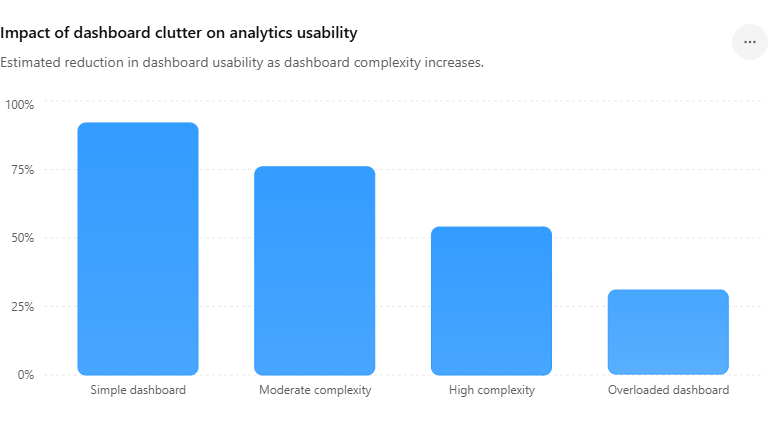
2. Dashboard Overload and Clutter
Many organizations attempt to place too much information into a single view. Overloaded dashboards often contain excessive charts, unnecessary KPIs, confusing layouts, and too many filters. This creates information overload, slower interpretation, and reduced user engagement. Complex dashboards make it difficult for users to focus on the most important business insights.
Solution: Focus on Simplicity and Clarity
Effective dashboards prioritize clean layouts, essential KPIs, and clear visual hierarchy. Organizations should remove unnecessary visual elements, limit excessive metrics, and design dashboards strictly around business objectives. Simplified dashboards improve readability and decision-making efficiency.
Dashboard Clutter Impact in Enterprise Analytics
3. Choosing the Wrong Visualization Type
Using incorrect chart types is another common visualization problem. Examples include pie charts with too many categories, overly complex custom charts, mismatched KPIs, and confusing visual structures. Poor chart selection can distort data interpretation and reduce analytical clarity, forcing users to struggle to identify trends or relationships correctly.
Solution: Use Visualization Best Practices
Organizations should select charts based on the specific type of analysis required:
- Line charts for mapping continuous trends over time
- Bar charts for categorical comparisons
- Maps for spatial and geographic regional analysis
- KPI cards for displaying single primary performance indicators
Maintaining visual consistency across workbooks dramatically improves reporting usability and comprehension.
4. Slow Dashboard Performance
As enterprise datasets grow larger, dashboards often experience performance degradation. Common causes include excessive calculations, unoptimized backend queries, unnecessarily large data volumes, too many visual elements on one sheet, and inefficient relationships in data models. Slow dashboards reduce user productivity, adoption rates, and operational efficiency.
Solution: Optimize Dashboard Architecture
Businesses should improve rendering speeds through query optimization, strategic data aggregation, incremental extract refresh strategies, and optimized backend calculated fields. Reducing unnecessary visuals, limiting live real-time queries across transactional systems, and utilizing scalable cloud data platforms keep dashboards snappy and responsive.
5. Lack of Real-Time Data Visibility
Many organizations still rely on delayed reporting loops. Static reports and basic scheduled refresh cycles create challenges in fast-moving environments where operational groups require live visibility, instant KPI tracking, and immediate performance insights. Delayed analytics reduces total business agility.
Solution: Implement Real-Time Analytics Systems
Organizations should adopt modern real-time data pipelines, cloud analytics architectures, and automated dashboard refresh solutions. Real-time dashboards instantly improve operational monitoring, ecommerce customer tracking, supply chain tracking, and immediate executive decision-making.
6. Inconsistent KPIs Across Departments
Different teams often define key performance metrics differently. For example, sales teams, marketing departments, and corporate finance teams may calculate a metric like "revenue" using contrasting parameters, creating stark reporting inconsistencies that lead to conflicting reports, reduced system trust, and strategic alignment confusion.
Solution: Standardize KPI Definitions
Organizations should establish centralized KPI semantic frameworks, consistent metric calculations, and enterprise-wide reporting standards. Data governance teams should manage and enforce KPI alignment across departments to ensure absolute trust.
7. Low User Adoption
Many business intelligence initiatives stall because employees do not actively use the compiled dashboards. This typically stems from a poor user experience, overly technical interfaces, confusing screen layouts, or a complete lack of proper training. If a dashboard is frustrating to navigate, adoption declines.
Solution: Build User-Friendly Dashboards
Visualization design should prioritize intuitive navigation, clean interfaces, responsive design across screen types, and business-focused reporting. Organizations must also provide hands-on analytics training, smooth onboarding, and accessible dashboard documentation to foster engagement.
8. Data Silos Across Systems
Enterprise information often exists in disconnected platforms—CRM tools, ERP systems, separate marketing databases, and stand-alone spreadsheets. Disconnected systems prevent unified data reporting and block true cross-department insights.
Solution: Centralize Data Sources
Organizations should implement centralized data warehouses and cloud analytics environments to consolidate information. Leveraging modern cloud databases like Snowflake, Google BigQuery, and Microsoft Azure helps unify enterprise data layers for seamless reporting.
9. Mobile Visualization Challenges
Modern operators access dashboards from smartphones, tablets, and remote field devices, yet many enterprise views are built solely for wide desktop layouts. This causes poor mobile usability, broken formatting, and reduced field engagement.
Solution: Design Mobile-Friendly Dashboards
BI teams should enforce responsive dashboard layouts, build dedicated mobile views, and use simplified visualization structures that function properly on compact touchscreens.
10. Security and Data Privacy Concerns
Enterprise analytics dashboards handle highly sensitive business metrics. Weak infrastructure or loose permissions can unintentionally expose proprietary financial numbers, private customer lists, and strategic business plans.
Solution: Implement Strong Analytics Security
Organizations must prioritize role-based access control (RBAC), row-level security (RLS), end-to-end encryption, and multi-factor authentication. Cloud BI tools provide robust security layers to significantly lower compliance and data exposure risks.
11. Lack of Data Storytelling
Many dashboards isolate metrics without providing helpful contextual guidance. Users can easily view historical lines or bar volumes, but often fail to understand *why* a certain trend occurred, what event triggered an anomaly, or what operational steps should follow, making the dashboard far less impactful.
Solution: Use Narrative Visualization Techniques
Effective dashboard designers explicitly call out key data insights, add context labels for historical anomalies, and structure views around clear decision-making narratives, guiding stakeholders straight toward actionable paths.
12. Scalability Problems in Enterprise Analytics
As business operations scale, analytics infrastructure must expand accordingly. Dashboards originally built to query smaller local tables often experience extreme delays or load failures when asked to handle enterprise data scale, high concurrent user counts, and wide department expansions.
Solution: Build Scalable Analytics Infrastructure
Future-ready reporting systems should utilize cloud-native data architectures, elastic query processing nodes, and highly optimized BI instances. Relying on scalable infrastructure ensures long-term operational consistency.
Most Common Enterprise Visualization Challenges
Future Trends in Solving Visualization Challenges
The future of enterprise visualization heavily leans into AI-powered dashboard layout optimization, automated insight narratives, predictive visualization analytics, conversational BI querying, and intelligent automated reporting systems. Advanced business intelligence platforms will increasingly automate chart selections, run background workbook optimization queries, and auto-detect data anomalies—lowering manual analytical complexity.
How KnexBI Helps Businesses Overcome Visualization Challenges
At KnexBI, we help modern companies modernize their analytics systems by implementing robust workbook optimization, high-speed real-time reporting pipelines, enterprise BI scaling strategies, cloud migration plans, and sound data governance models.
We systematically improve workbook rendering performance, clean up bloated KPI layouts, centralize fragmented reporting platforms, and create intuitive business intelligence environments. Our specialized engineering services turn raw data into a reliable, lightning-fast corporate decision asset.